Colourful Confessions


I must confess, this post is more about colour indulgence than about colour direction, my fascination with them and my Alice-in-Wonderland moments throughout my association with the world of colours.

I don’t think I’ve ever perceived colours in isolation…

My earliest memories of colours are of my mom referring to them through association with objects found in nature – kathirikkai colour (the colour of a brinjal), kili pachai (parrot green), etc. What an apt way to bring out the nuances of colours – visualization and imagination become crystal clear!

At school, my friends and I would comment on our peers’ choice of clothes through their colours – We need sunglasses to even look at himHow on earth can she pull off a colour like that… I guess we were referring to the appropriateness of the colours people wear.

Early in my career I had a colleague who had a unique standard to measure colours – through their “sweetness” as she termed it. She would throw statements like “that’s too sweet” and then proceed to correct the tone of a shade while working on it. Perhaps it was her way of saying that you need to hit the “exacting shade – sweet spot” on colours.

Image-Flowers-Tender-Leaves

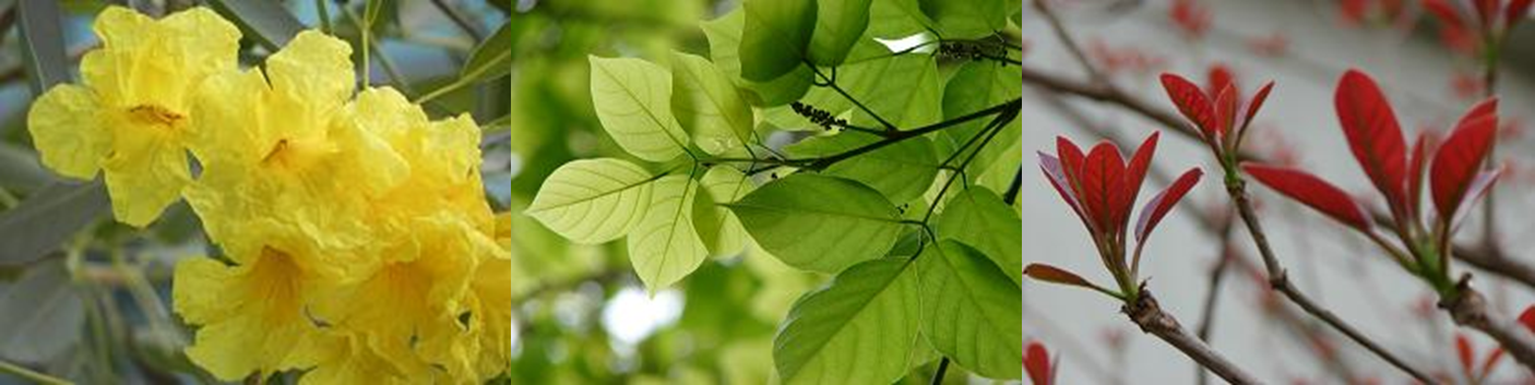
During my stay at the capital, I was captivated by the sheer brightness of the yellow flowers on a Tabebuia Argentea tree – they stood out in fresh contrast to the dust and grime on other parts of the tree. The radiant shade was a reminder of the cyclic nature of life, and it offered cheer and hope for the days to come.

I love admiring the bright green of tender leaves as they sprout during spring – Is it a light green colour that I see, or is it a light green light? Then again, luminosity is a factor that adds a whole new spectrum to the realm of colours.

Physics defines COLOUR as “the property possessed by an object of producing different sensations on the eye as a result of the way it reflects or emits light.” How boring and staid a way of conveying something that is so vibrant, so riotous, so passionate, so effusive!!!

Design school taught me the academic or official names of colours. The people I’ve worked or interacted with throughout my life have taught me that colours can be defined through more ways than one from poetic to political undertone.

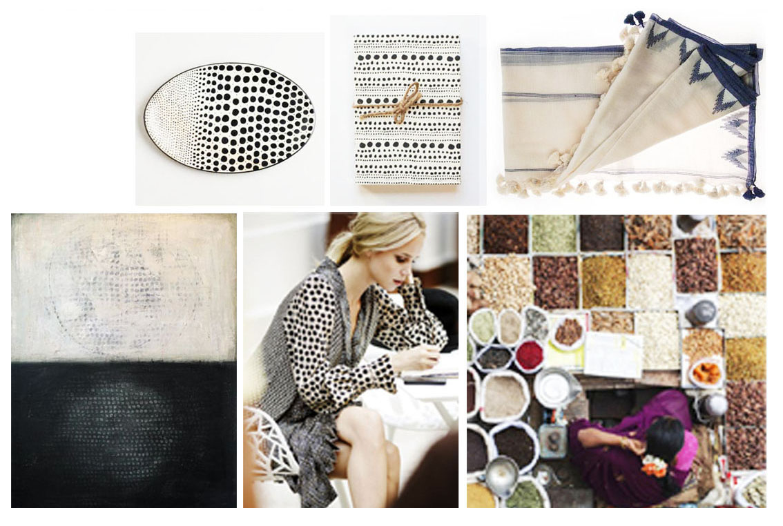
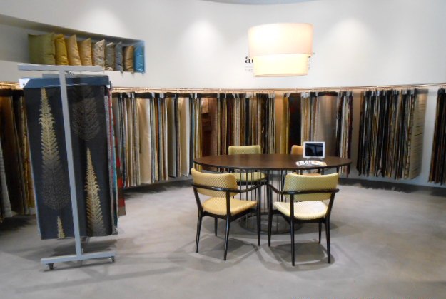
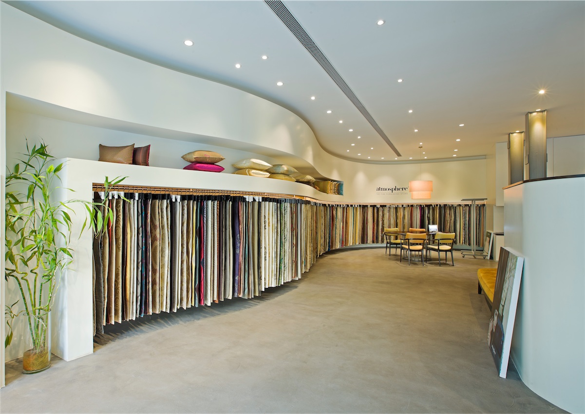
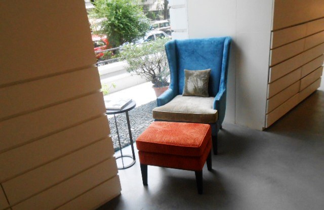
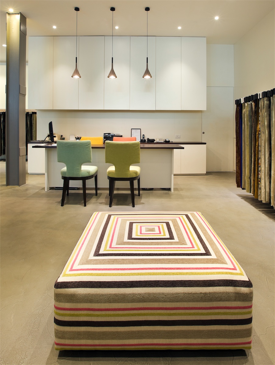
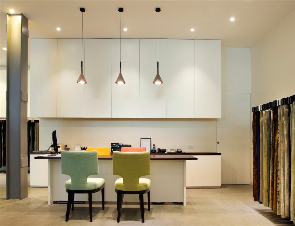
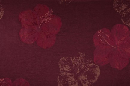
One of the best things about being a designer is the myriad opportunities you get to work with and be transported into the magical world of colours. Twelve years into my career, I still jumped at the opportunity to dive headlong into this magical world – I worked on an assignment to identify colors for a new project… Wow! What an awesome experience it was to be surrounded by and to explore chips of fabrics of all kinds in a variety of colors.

Colors Project

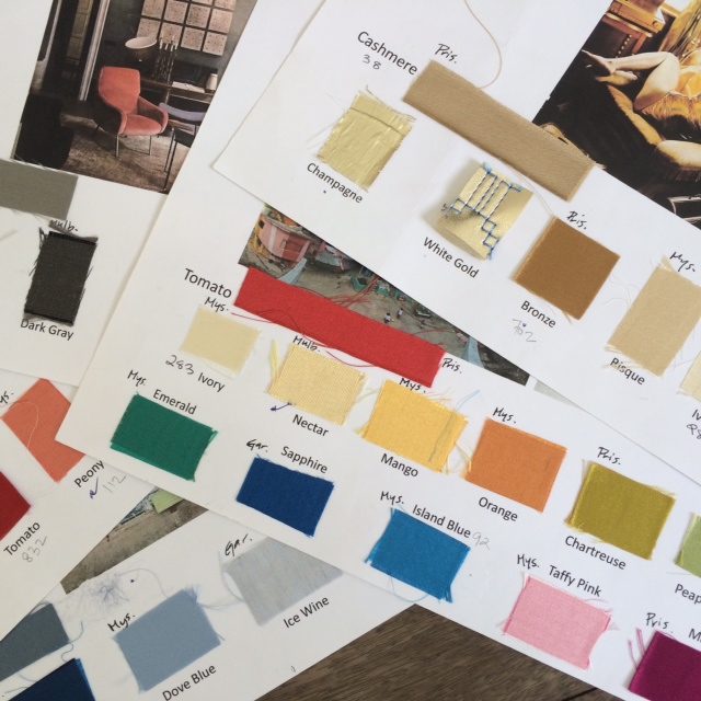
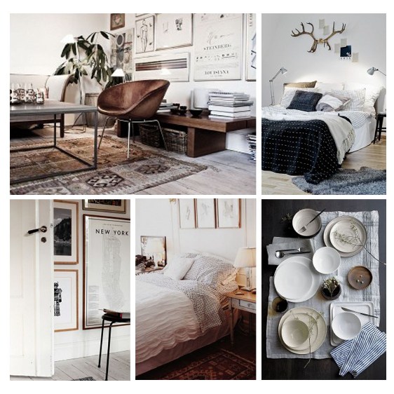
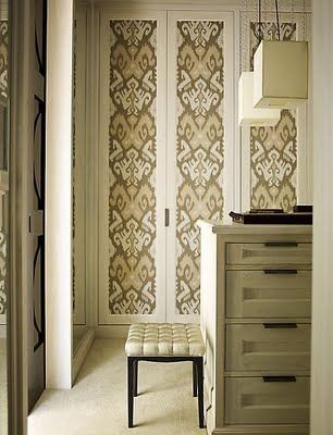
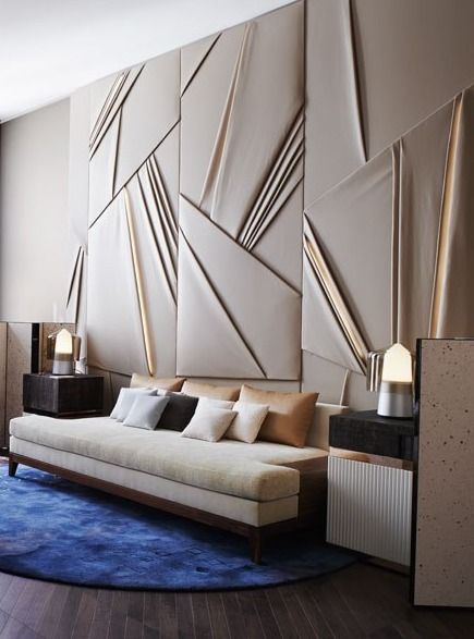
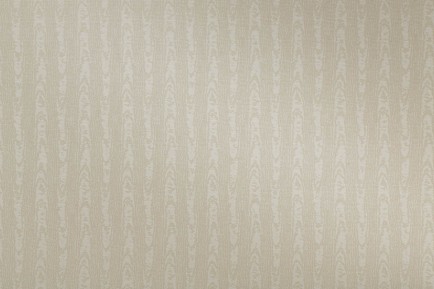
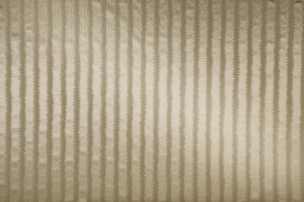
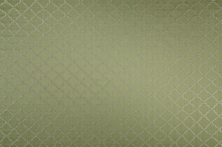
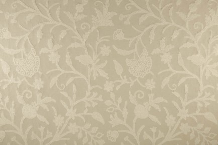
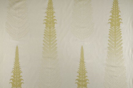
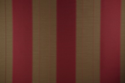
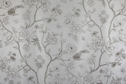
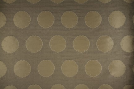
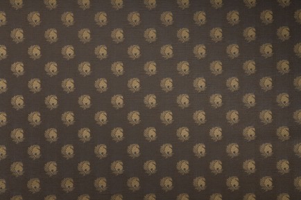
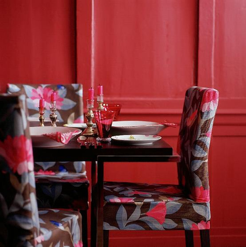
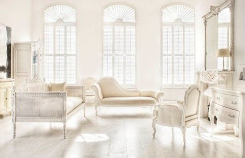
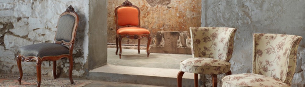
Do we really understand how the texture of a surface redefines colour as we traditionally know it? The same color applied on different surfaces suggests different possibilities and throws up a plethora of shades.

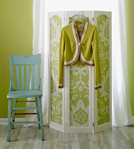
Mystic and soft on velvet, crisp and cool on linen, confident and boisterous on satin, simple and bare on percale, glamorous and arrogant on flat viscous velvet, majestic and sexual on silk – the same colour conjures up entirely different visuals, aesthetics and emotions when the surface varies…

This is like being transported into a novel let to explore the vividly detailed wonderful landscapes and rich characters in it. Where, each color is a character in a pattern that is the plot. My ability to shift and change the colors leave me satisfied with the feeling that I could change the course of the novel.

The spectrum of colours is endless… and so are the possibilities they offer.


Inspired Style

Great things are done by a series of small things brought together

– Vincent Van Gogh

blog images 1.1

An inspired home is a reflection of an inspired life – a gathering of a series of meaningful products and events, curated carefully to define ones sense of self.

blog images 2

Sometimes it is important to pause and decipher what really inspires us in the present…

What are our eyes drawn to? What do our hearts remember?

From this flows, an authentic sense of self and personal style,

Refreshed as we experience and learn further.

Our homes are ever evolving, a reflection of our own journey.

There are no rules, except one – staying true to our own culture of style

Lost in the fabric of life

Fabric, the most flexible, creative, component of furnishing isn’t given nearly as much as credit as it deserves. It’s a real pity that fabric has been confined to the mundane geography of sofas and chairs for years. With an open mind and some good fabric, you can bring a home completely alive, pulsating with color and creativity. Here are a few ways that you may or may not have already thought about to use upholstery in your home.

Lamp Shades
We buy fabric-based lamp shades all the time. Why have we never thought of creating our own? We’re not talking about just table or floor lamps, we’re talking about grand hanging lamps, humble wall lamps and just about any light-providing contraption you can get your hands on. Pick a fabric that you love and go with it! Light up your home in ways that are meaningful to you.

Image 1-Colaba Store

Picture caption: The lamp shade in the picture, is created using Atmosphere fabric at our new store in Colaba, Mumbai.

Wardrobes
Give yourselves a break from the nice enough wooden wardrobe. Upholster your doors to create various effects, from the grand, luxurious tufted velvet, to the warm, cozy-cottage floral print. Either way, it breaks the monotony of wood and really gives you something different to be proud of.

Image-2-WardrobeRoom Dividers

Since the widespread popularity of doors, these lovely pieces of furniture ceased to be as important as they used to. Now, they work wonderfully as pieces of décor, provided they are beautiful enough. What better way to ensure that than to hand pick the upholstery for your room divider yourself? Floral, minimal, velvet, silk, printed… the possibilities are endless.

Image-3-Roomdivider

Doors
Use your doors, the most bland, common part of any house, as a canvas for color and art. Some people paint their doors in creative ways, and some use fabric. Both techniques create equally phenomenal results.

Image-4-Door

Head Boards

Make a grand affair of your bed by designing a large, upholstered head board. Goodbye, boring wood and iron, hello plush fabric! Wake up every morning almost forgetting that your home is not, in fact, a French chateau or an Arabian palace.

Image-5-Headboard

Picture caption: This is an installation from our Colaba store. This plush, paneled wall behind the bed is upholstered with our very own Atmosphere fabric.

Wall Panels
Fabric-based wall panels are most commonly used for sound proofing and acoustic manipulation, or on the wall behind a bed to create the illusion of a giant headboard. Do not feel restricted, however. Wall panels can go almost anywhere. They can transform a space much differently from wall paint, or wall paper and are definitely worth the investment. Besides, how many people you know have wall panels in their homes?

Image-6-Wall paneling We’d love to see your creative use of upholstery in your home. Write to us, send us pictures and we would love to feature you on our social media.

Until next time,

The Atmosphere Family

Our All New Colaba Store

Fabric is more than a cloth you use to upholster your sofa. It is a canvas of art, a palette of colours… a skin for your furniture, if you will. We now have a brand new store in Colaba, Mumbai. The store showcases our fabrics in innovative ways. We recommend a visit to get a first hand experience of the refreshing interiors.

Below are some of the images from our newly done store. We would also like to see how you have used fabrics in an interesting way. Share away!

Colaba_Store_1

Colaba_Store_2

The space is elegantly designed. The minimal flooring and walls help accentuate the vibrant colors of our fabrics and accessories.

Colaba_Store_3

The paneled cushion head-back of the bed extends the soft, plush feeling of warm luxury and comfort.

Colaba_Store_4

A grand perspective of the store’s minimal interiors in white, wood and cement.

Colaba_Store_5A play of colors in our choice of upholstery

Colaba_Store_6

This is something we would love to see in homes: ’color blocking’! We decided to have fun with the choice of fabrics for this particular seating. The fabrics used here are Phlox-2515, Phlox-2509 and Phlox-2513.

Colaba_Store_7

Almost as edible as candy. This striped ottoman is just delicious.

Colaba_Store_8

Whoever said all your chairs have to be the same color does not know how to have any fun.

Colaba_Store_9

The fabric used on the hanging lamp shade is ours too. Have you tried experimenting with fabrics and lamp shades in your own home? If not, now’s the time.

These are just a few of our designs. No matter what your taste, there’s bound to be something for you.

If you’re ever in Mumbai, we do hope to see you at our Colaba store. But until then, don’t forget to send us pictures of how you’ve creatively used furnishings in your home and we may feature you on our Facebook page, for the world to see!

(Architects & Picture courtesy: Khosla Associates)

Until next time,

The Atmosphere Family

Sensibility Never Looked This Good

Luxury is perfectly nice and we all love a certain amount of it, but is it always practical? Does it always make sense to fall asleep and wake up in an endless abyss of throw cushions, tassels, lace, pillows, silk sheets, bedspreads, duvets and comforters?

Frankly, no. Not always is it sensible to have to deal with that much comfort and fancy, especially first thing in the morning. Take it from a luxury brand that it is absolutely okay to want to sleep on something more… sensible.

BedSense

Exactly as the name suggests, BedSense is a line of bedskins in simple, no-fuss designs and colours; bringing sense and sensibility to the bedroom. BedSense sheet-sets and spreadsheets are for the home which requires practicality above all things, but will not compromise on aesthetic or quality, or price.

You aren’t going to be terribly spoilt for choice, but that’s what you wanted. You are, however, spoilt for quality and most of all, you’re spoilt for price.

BedSense - Blog

Visit the website to have a look at all our designs, from the functional yet elegant solids, to the classic stripe, the fun colours, the more daring jacquards and our dual-toned bed spreads. Introduce sense and sensibility back into your home.

We do hope you enjoy our newest line of products.

Until next time,

The Atmosphere Family.

Nothing lasts. Nothing is finished. Nothing is perfect.

Wabi Sabi Design.

Wabi Sabi, drenched in influences from Chinese and Buddhist art and philosophy is now mostly thought of as a Japanese movement or ideal. The basis of Wabi Sabi as a design idea is that beauty is found in imperfection; imperfection in the most natural, organic sense of course. Nature is not always symmetrical or linear, nature is not consistent and nature certainly is not predictable. Nature, however, is perfect because of its imperfections.

Being a luxury brand of furnishings, we’re all too familiar with an attitude among consumers that’s becoming painfully popular; the irrational demand for extravagance in design and a compulsive requirement for symmetry and perfection; the bedroom set, the living room set and various other ‘sets’. An anonymous quote we came across could not have been more perfect; ‘A room should feel collected, not decorated.’

How do you know if something is Wabi Sabi? Easy. If something makes you feel a longing for nature or a spiritual experience or just an appreciation of the earth and its ancient beauty, it’s probably Wabi Sabi. Homes that have been ‘collected’ with this ideal in mind are usually stunningly eclectic and steeped in world history and culture. Their owners are citizens of the world, mostly with an evolved understanding of life. Not to say that these are prerequisites. However, if this style fascinates you, you’re probably on the same level.

It might seem like a contradiction for a luxury brand to be promoting a movement like Wabi Sabi, but we have our roots firmly planted in our love of culture and art from around the world. The following are a few of our designs that might fit right in with your Wabi Sabi way of life.

1. Criss Cross – Inspired by trickling water, this minimal design fits the Wabi Sabi bill perfectly. http://bit.ly/19DVdXV

CrissCross

2. Walden – This wonderful weave resembles the bark of a tree; ancient and all-knowing. http://bit.ly/187gXfv

Walden3. Wild Hibiscus – The stunning wild hibiscus afloat on a crimson river. This particular piece used in a mostly white room would be starkly stunning. http://bit.ly/187gXwa

Hibiscus

4. Silken Route – This ikat stripe and all the colours it comes in is a wonderful example of imperfect Wabi Sabi simplicity. http://bit.ly/14NAJwl

SilkenRoute

We hope this piece has inspired you to explore the wonderful world of Wabi Sabi and all that it entails.

Until next time,

The Atmosphere Family

India, You Beauty

Our exotica is envied and our art is imitated endlessly, not without reason. Indian art and culture has been reincarnated in various forms through the ages and its beauty has remained consistently timeless. At Atmosphere, our work is deeply influenced by Indian styles and designs, ancient and modern alike. Why would we ever look anywhere else but home for inspiration?

Here’s a peek into the various ways in which we incorporate India into our work.

1. Fretwork: Inspired by the latticework seen in so much ancient architecture around India, an example being the Fatehpur Sikri. http://bit.ly/14LvsI0

Fretwork

2. Nishat Bagh: From a place that many people call heaven on earth, Kashmir. We need say no more. http://bit.ly/13A0wUS

Nishat Bagh

3. Sacred Tree: The tree of life, a concept that has existed through time, through religion, philosophy and mythology, is a beautiful motif, one that provides endless inspiration. http://bit.ly/13A0xIt

Sacred Tree

4. Myanmar: Influenced by the famously beautiful Kanchivaram Saris of South India. http://bit.ly/16k5NG1

Myanmmar

5. Coromandel: Flirtatious Southern Coastal beauty; the birds in the trees, tropic love, endless beaches. http://bit.ly/16PyGbk

Coromandel

6. Aajara: The Mughal era brought with it some of the finest cuisine, colours and art, inspired by magnificent royalty.  http://bit.ly/1d6JRza

Aajara

7. Kalka: Last but not least, we could not leave out our well-loved Paisley. This will never go out of style. http://bit.ly/13k2EFB

Kalka

Like we said, this is only a peek. Look around you and be inspired by home grown beauty. It is everywhere. We’re proud to be Indian. Happy Independence Day.

Until next time,

The Atmosphere Family

To Open or Not to Open

This post is inspired by a discussion on our Facebook page, around the pros and cons of having an open kitchen in India. Why is India even a factor here? For many reasons, which we’ll outline through the course of this post. We’re going to take you through our pros and cons of having an open kitchen and we’ll start with the cons.
OpenKitchen ReferenceCons:

1. Dust. This is inescapable in any Indian city. It is the endless plight of every urban household and the last place we want our dust is on the food we eat.

2. The smell of a lovely Indian curry… all over your house! We love our curries… but only at meal times. Nobody wants butter chicken in the bedroom.

3. Your domestic help, the people behind your pristine home, are in full view as they work. Most people in the city have hired people to help run the household but nobody wants to shatter the illusion that they’re doing it all on their own. When your friends are over and your trusty maid is doing what she does best in your open kitchen, it becomes pretty clear just how your home has managed to remain this perfect. A silly, superficial problem, but a problem nonetheless.

4. Space, or lack thereof. An open kitchen would deprive you of one wall, two even. That’s two entire walls of cabinets you’re missing out on. Where will all that kitchen apparatus go? It’s a vexing situation, not having enough space, and you might just be faced with it if you don’t have a separate storage room.

5. It’s a free-for-all play area for the kids. Even a wall can barely keep a determined 5-year-old out of a room he’s not meant to be in. Managing to keep your curious kids away from the dangerous equipment in your open kitchen will definitely be a challenge.

Pros:

1. It’s just beautiful. Open kitchens are magical. They are aesthetically so much more pleasing than a closed off room.

2. The light that pours in from the rest of your home will flood your kitchen and you’ll be able to bask in an abundance of sunlight as you go about your day. What difference does sunlight make? You’ll feel it when you’re surrounded by it and trust us, it feels good.

3. Entertain while you cook up a storm! You’ll no longer need to worry about entertaining your guests while your meal still needs attention in the kitchen. You can start cooking your meal when they arrive and it will barely be noticed. In fact, they’ll have a lot more to say about your culinary prowess at the end of the night.

4. Space. Walk, dance, run, long-jump or roller-blade around the island counter; you might be able to do it all in an open kitchen. Space is something that is very hard to change in a closed kitchen and something to be enjoyed in an open one.

5. Keep an eye on the kids as you cook. You don’t need to step away from your work every 5 minutes to check on your kids anymore. If they’re hanging out in the living room, doing homework on the dining table or playing Lego on the island counter, you’ll be able to keep them under your radar at all times.

As you can see, it’s a difficult dilemma to be in, choosing an open or closed kitchen. If this is your situation at the moment, we hope this break down of pros and cons helps.

Until next time,

The Atmosphere Family

Living inside a Rainbow

Skeptics may disagree, but it is no lie that colours affect our moods and feelings. The power to keep your mood and energy levels up is actually in your hands, so use this guide and decorate wisely!

Green:

GreenWe spend our lives straining our eyes on computers and televisions. Green is known to be the easiest on the eyes, among all the colours of the spectrum. Being surrounded by green gives us a natural, at-home feeling. In this age of concrete and glass, some nature, or even a vague resemblance of nature, is what our bodies crave the most.

Yellow:

Yellow

This gorgeous colour is most commonly associated with sunshine, joy and excitement. It is said to stimulate our senses and keep the energy levels up. Yellow is a great colour for kitchens. Bear in mind, when used in excess, yellow can create feelings of agitation and frustration. When decorating, small yellow accents such as cushions or curtains are the best way to go. Everybody could use a little sunshine in their lives.

Blue:

BlueLike the element blue is most closely associated with, this colour creates a sense of calm and relaxation. Blue is not a great colour for a home, office or a kitchen, where one needs to stay alert and focused. Dining, living and leisure spaces would do well with a lovely blue wall, or sofa. Deep blue, on the other hand, has been known to create feelings of negativity. If you’re going the blue route, it’s best to stay on the lighter side.

Red:                                      

RedIf we’ve learned anything from the onslaught of the media, we’ve learned that red is directly related to passion, romance, love and all things exciting. This is true to some extent, only as far as stimulation goes. Red is known to create feelings of passion and excitement, sexual and otherwise. However, this dangerous colour, when used in excess or in deeper shades such as crimson, work in the other direction. It creates feelings of hostility, rage and frustration. Much like the colour yellow, red is best used in small, tasteful doses.

Neutral:                                    

NeutralBrowns, beiges and greys all fall under the neutral category. These colours don’t really do much for your senses or moods but act as an easy palate on which you can use splashes of colour and embellishments. When using reds and yellows, a neutral palate would make a lovely background to these temperamental colours.

White:                                    

WhiteAll-white interiors are spectacular. White as a colour is magnificent enough on its own and it can also be used as a palette for colourful embellishments. However, some say that the reflective quality white tends to amplify feelings that you may already have. This includes anything negative. As long as you’re happy, your beautiful white interiors will ensure that you stay happy.

The more colourful your home, the more exciting your life will be. Create a home that excites every sense, invokes all kinds of feelings and you will never tire of your surroundings.

Until next time,

The Atmosphere Family

We have started blogging!!

Hello and welcome to the Atmosphere blog!

Here you can expect to see fun reads on everything related to good design. We’d like to share what we’ve learned over the past 25 years that we’ve been in the industry; an industry that is always changing. New colours, new styles, new trends, new designs. There’s so much to keep up with and we’ll help you do that.

A good home is made with lot of love and care and really, that’s all you need. But it doesn’t hurt to enjoy some comfort. Your home is your sanctuary away from the madness of life, the one place you can be yourself. The way you decorate is an unadulterated expression of who you are. Think of your home as a canvas for your art. Doesn’t that excite you? You get to be completely surrounded by what you create.

Visit us here every week for a new post and feel free to write to us if you’d like us to cover a particular subject.

Until next time,

The Atmosphere Family.