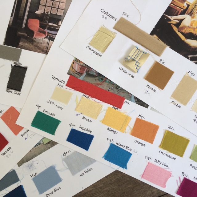
I must confess, this post is more about colour indulgence than about colour direction, my fascination with them and my Alice-in-Wonderland moments throughout my association with the world of colours.
I don’t think I’ve ever perceived colours in isolation…
My earliest memories of colours are of my mom referring to them through association with objects found in nature – kathirikkai colour (the colour of a brinjal), kili pachai (parrot green), etc. What an apt way to bring out the nuances of colours – visualization and imagination become crystal clear!
At school, my friends and I would comment on our peers’ choice of clothes through their colours – We need sunglasses to even look at him…How on earth can she pull off a colour like that… I guess we were referring to the appropriateness of the colours people wear.
Early in my career I had a colleague who had a unique standard to measure colours – through their “sweetness” as she termed it. She would throw statements like “that’s too sweet” and then proceed to correct the tone of a shade while working on it. Perhaps it was her way of saying that you need to hit the “exacting shade – sweet spot” on colours.
During my stay at the capital, I was captivated by the sheer brightness of the yellow flowers on a Tabebuia Argentea tree – they stood out in fresh contrast to the dust and grime on other parts of the tree. The radiant shade was a reminder of the cyclic nature of life, and it offered cheer and hope for the days to come.
I love admiring the bright green of tender leaves as they sprout during spring – Is it a light green colour that I see, or is it a light green light? Then again, luminosity is a factor that adds a whole new spectrum to the realm of colours.
Physics defines COLOUR as “the property possessed by an object of producing different sensations on the eye as a result of the way it reflects or emits light.” How boring and staid a way of conveying something that is so vibrant, so riotous, so passionate, so effusive!!!
Design school taught me the academic or official names of colours. The people I’ve worked or interacted with throughout my life have taught me that colours can be defined through more ways than one from poetic to political undertone.
One of the best things about being a designer is the myriad opportunities you get to work with and be transported into the magical world of colours. Twelve years into my career, I still jumped at the opportunity to dive headlong into this magical world – I worked on an assignment to identify colors for a new project… Wow! What an awesome experience it was to be surrounded by and to explore chips of fabrics of all kinds in a variety of colors.
Do we really understand how the texture of a surface redefines colour as we traditionally know it? The same color applied on different surfaces suggests different possibilities and throws up a plethora of shades.
Mystic and soft on velvet, crisp and cool on linen, confident and boisterous on satin, simple and bare on percale, glamorous and arrogant on flat viscous velvet, majestic and sexual on silk – the same colour conjures up entirely different visuals, aesthetics and emotions when the surface varies…
This is like being transported into a novel let to explore the vividly detailed wonderful landscapes and rich characters in it. Where, each color is a character in a pattern that is the plot. My ability to shift and change the colors leave me satisfied with the feeling that I could change the course of the novel.
The spectrum of colours is endless… and so are the possibilities they offer.


